Feb 3, 2024
READ TIME: 5 MINUTES
Welcome back, Renaissance man 👋 .
Today, we have something special; I want to show you important e-com product page conversion sections we implemented that have generated over $7,000,000 in sales.
TODAY, AT A GLANCE
Optimize Above the Fold: Clear, Benefits, Structured.
Strong Visuals: Engaging, Structured, Proof.
Benefits and USPs: Visual, Problem-Solving, Effective.
FAQ: Comprehensive, Reassuring, Trust-Building.
Massive Social Proof: Testimonials, Recognition, Authentic.
Us vs Them: Differentiation, Quick, Convincing.
How to Use: Clear, User-Friendly, Informative.
Strong Offer: Strategic, Persuasive, Visible.
Multiple CTAs: Easy, Attention-Grabbing, Effective.
Before & After: Visuals, Instant, Impactful.
Money-Back Guarantee: Prominent, Assurance, Confidence-Boosting.
ABOVE THE FOLD
This is the most critical section of your whole product page.
When people land on your page, the first thing they see is the above-the-fold section.

If this is unclear enough or has no benefits or compelling CTA’s, you will lose customers!
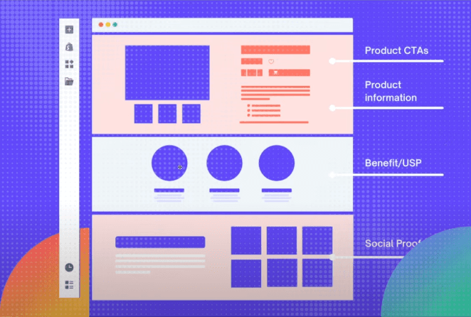
In the image above, you can see how well-structured the Above the Fold is.
It has a strong problem-solving title; reviews are visible, proof of an expert, and 6 more benefits of the product with a clear CTA underneath.
They nailed it, and that’s all you need to implement.
The product offer will be displayed at the bottom of the product page.
STRONG VISUALS.
You want to have strong visuals implemented on your product page.
As you can see, there is 1 main image and a few slide images, which you can scroll through.
Below that, another section is again divided with visuals such as benefits or USP.
Then again, within the next section, you see social proof.
If you look, it's visually showcased, not just some laps of text.
All sections are divided into an excellent structure with images to make it visual.
It always should be Image → Copy → Image → Copy → image → Copy, and so on.
We've been doing that since 2019, and it's still the best way to structure your product pages this way.
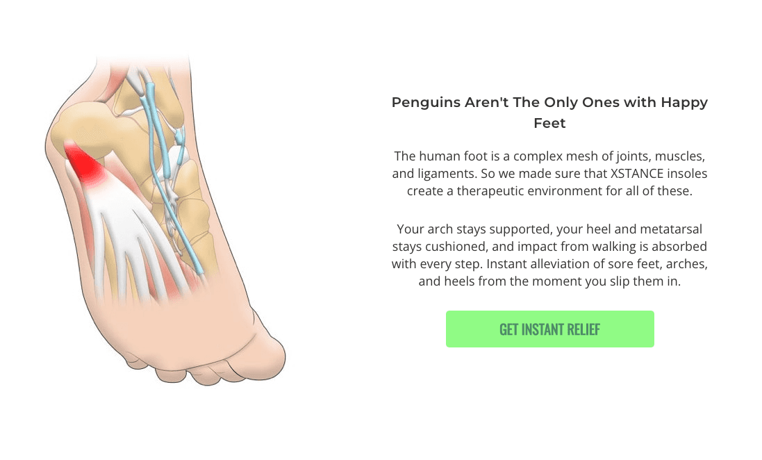
BENEFITS AND USPS.
This should be visual.
Always image → copy → image → copy.

Always understand the problems people face when considering buying your product.
As you can see, Manta Sleep nailed it with the "Unique Raz-thin Bluetooth headphones."
Many people buying this mask have issues when sleeping on their side due to the speaker's discomfort.
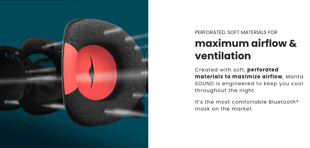
Again, people have issues with this mask because they can be uncomfortable getting heated while trying to sleep.
They tackled this again with their maximum airflow & ventilation feature, leading to “To keep you cool throughout the night.”
Do you see how they keep things short and all features solve problems?
Keep it short, visual, and solve problems.
FAQ.
It's also a mighty section many drop shippers must implement on their product pages.
This is perfect if you can not tackle all other objections people might have.
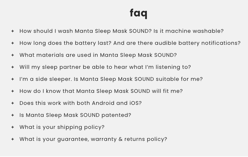
Instead of creating 12 separate sections with all your product's benefits or features.
Within the FAQ section, we can tackle the rest of our customer's objections.
The best way to do this,
Go to Amazon and find different listings of the product you are selling or products similar to the one you are selling.
Then, check what people are so negative about in the reviews so you can mention this within the FAQ to tackle these objections,
leaving the customer no choice but to check out from your store.
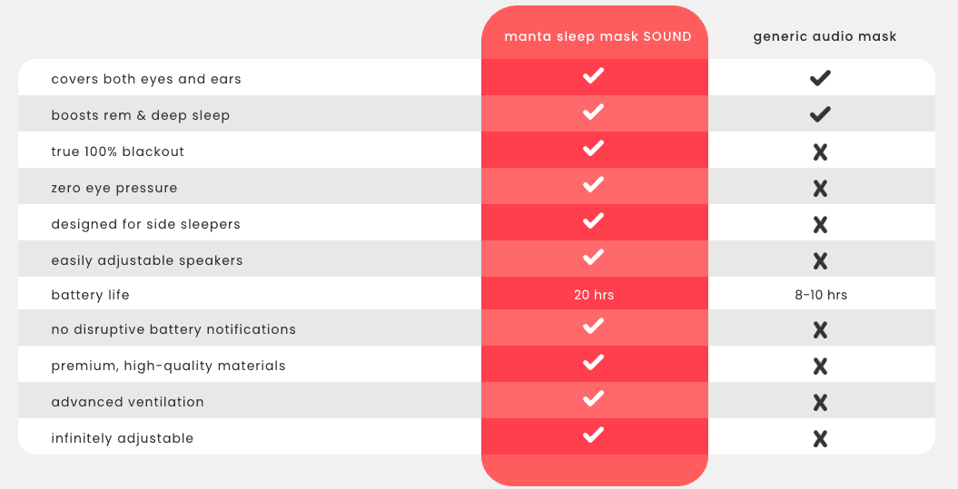
MASSIVE SOCIAL PROOF.
This is the most potent section you should have on any winning product you are running.
People are just like sheeps. If you bombard them constantly with massive social proof, there is no other option than to trust you.


Do you see how Mantra Sleep nailed this?
They got video testimonials and user-generated images of other customers using their products. Lastly, they closed the page off with the customer review section.
Another example,


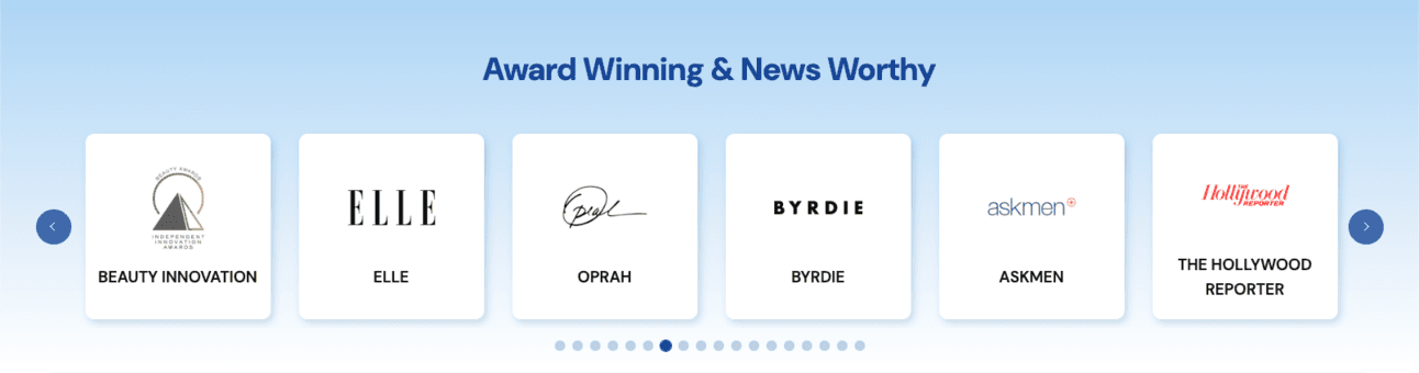
People all know these big names,
by having this kind of social proof on your website, people instantly trust you because these are well-known publications and brands.
Yes, it’s not the most ethical thing we can do as drop shippers, but if you go for this route, you can easily recreate something like this with any page builder you are using.
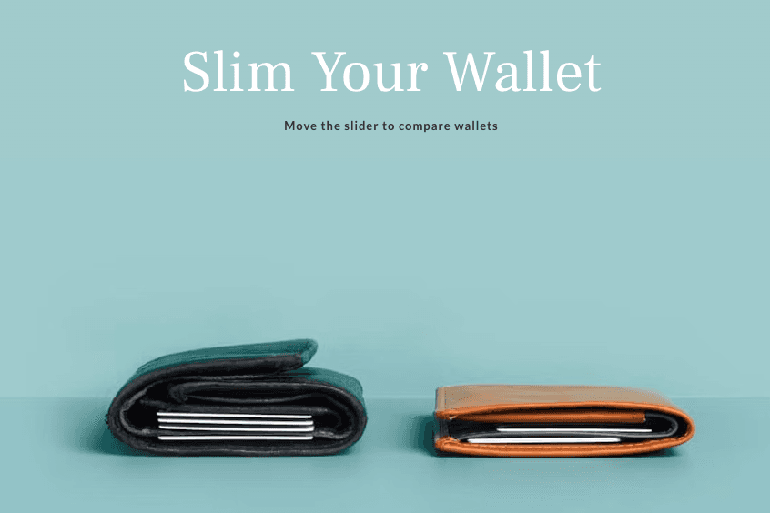
US VS THEM.
We implement this right away for every winner we find.
It's easy to create and can be done within 5 minutes in Canva.

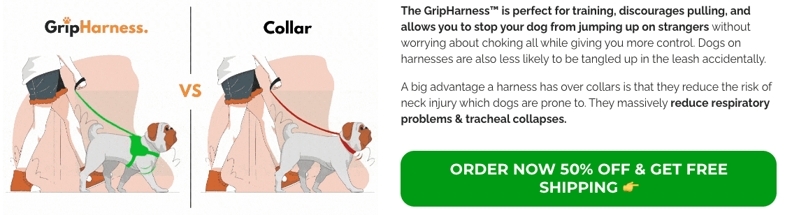
The US VS THEM section is enormous for differentiation.
You show the customer they should not look further because you have the best product.
Leaving them no other choice than to check out.
HOW TO USE.
If you are selling more complicated products, people need help visualizing how to use these products.
You must create a section about "How to use" the product.

Because if people do not understand how they can use it,
People will leave your page.
They don’t want to sit there figuring out how it works.
If they don't know.
You will lose customers.
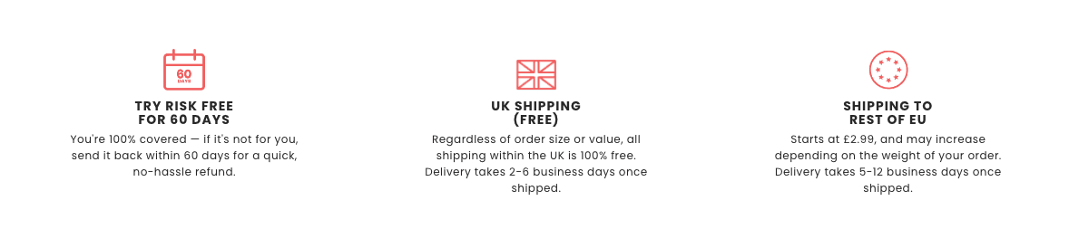
STRONG OFFER.
Always at the end of your whole description, you should close off with a firm offer.
For instance, can you remember the first section, "Optimize above the fold"
This seller is using the same structure as Gripharness.com
You see, most drop shippers follow a conventional funnel approach:
They start with advertising on platforms like Facebook.
Next, they swiftly present the product offer.
And finally, customers are left to scroll down to explore product details at their leisure.
But we do things a bit differently, and here's why:
We kickstart with an attention-grabbing ad.
Then, we dive straight into an in-depth product description.
Only after the customer is well-informed do we unveil the product at the bottom of our product pages.
Our goal?
To ensure every customer comprehensively understands the product before making a purchase.
If you start with your offer immediately, people will take it or leave it without reading the rest of your copy to convert them.
The longer people stay on your product page, the more likely they will be converted.
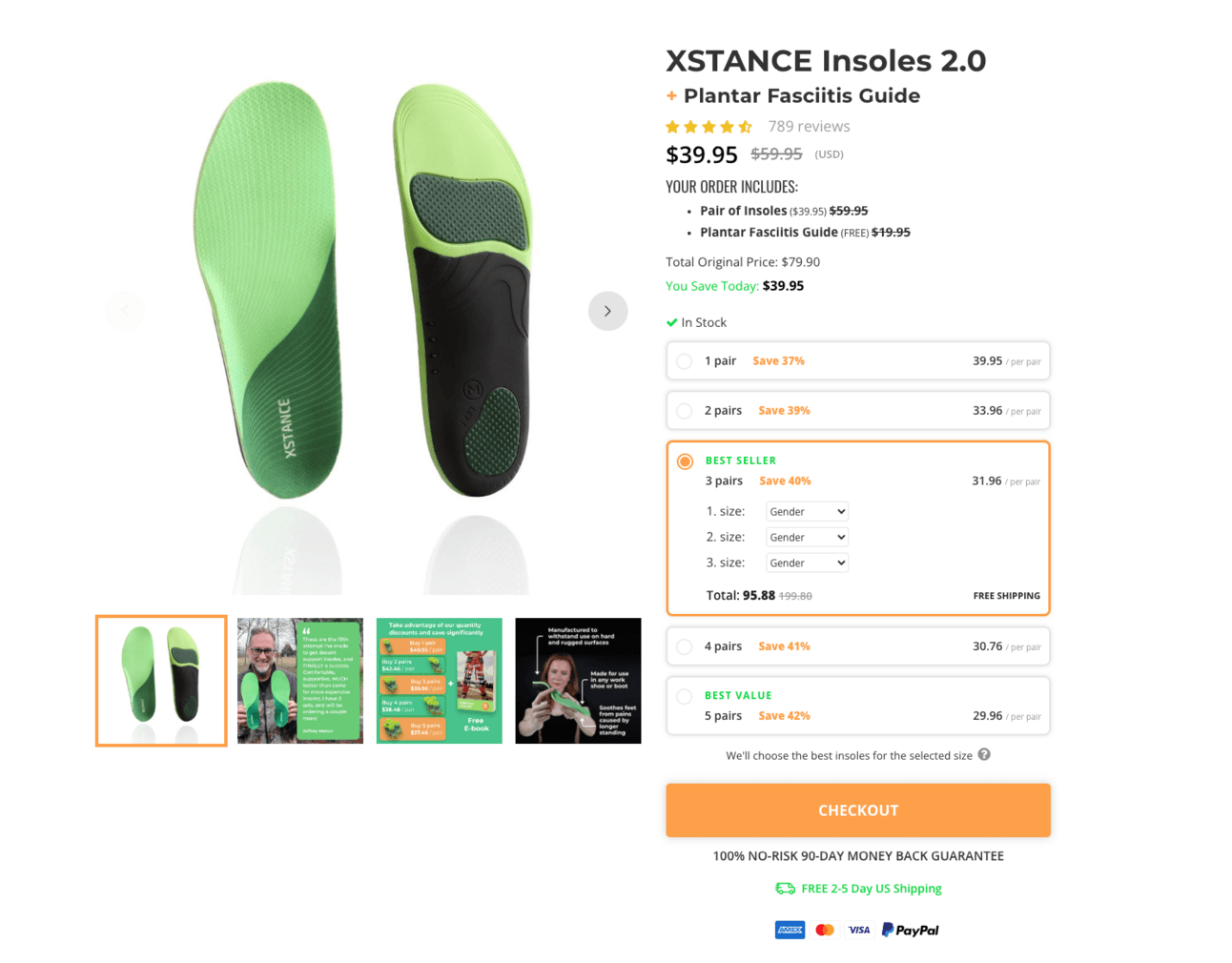
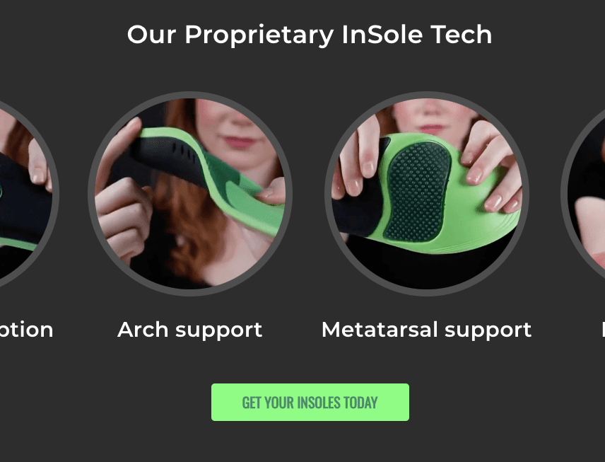
Xstance Insoles closed off their product page with this section.
MULTIPLE CTA’s
As you see, all those sections can take up a lot of space within your product page.
The main focus of multiple CTA's is to make it easy for people to checkout.

In the time we live in now, people have short attention spans.
If we can not make the checkout process for them easy,
you will lose them, and they will bounce off your website.
You should always have multiple CTAs on your long-form product pages.
If it fits outside your product page or is too pushy.
Then, at least ensure a sticky add-to-cart app is enabled on your product page.

This sticky add-to-cart will be visible 24/7 at the bottom of your product page, making it easy for people to checkout.
HIGH CONVERTING PRODUCT PAGES.
I’m excited to announce that we have partnered up with PAGEFLY.
So, what does this have to do with me?
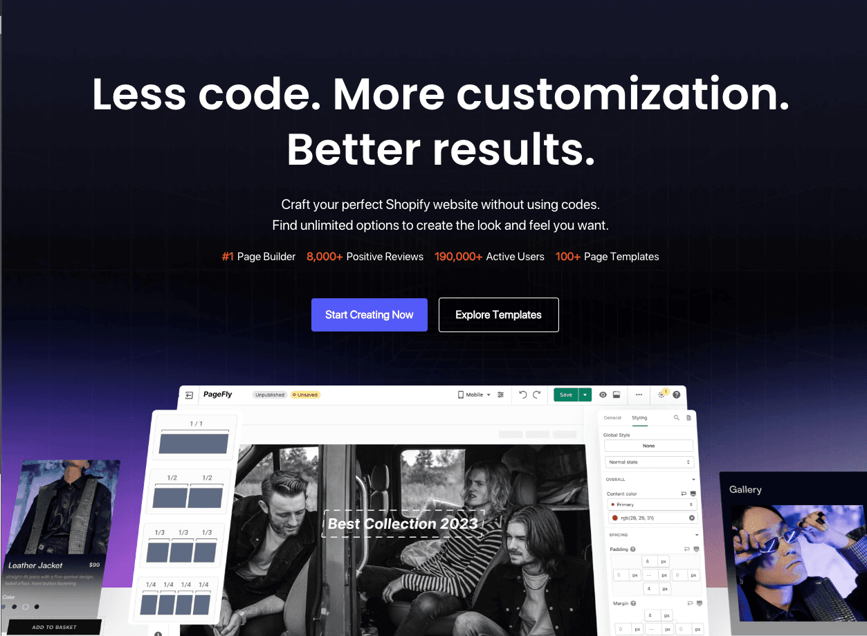
Pagefly makes it easy for drop shippers to create high-converting product pages with no code, drag and drop.
WHAT YOU CAN EXPECT:
🤖 No-code drag-and-drop - drag-and-drop feature makes website design a breeze.
👍️ Integrated with the best apps - Effortlessly position your apps' widgets for maximum impact using PageFly's drag-and-drop feature.
🤑 Compatible with theme - PageFly works with most Shopify themes, allowing you to add content without affecting theme assets.
As we have partnered up,
PAGEFLY has gifted our community a 10% lifetime discount.
use code “PFAFFILIATE10” to get 10% off.
BEFORE & AFTER.
This should be a no-brainer.
If you have the chance to create this section or have images displayed within your product images about before & after, you should have it.
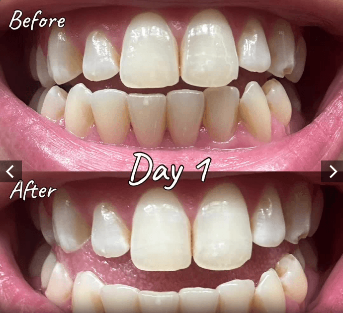
Before & after images convert so well simply because people can see instant results.
MONEY BACK GUARANTEE.
Always have the money-back guarantee visible on your store with other features you want to highlight.
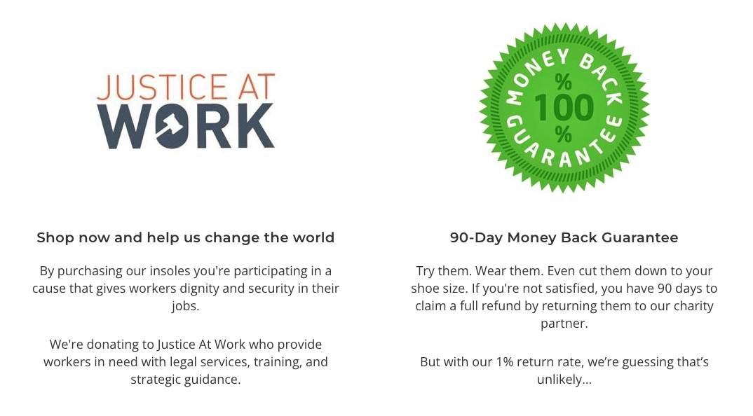

This should be standard, but I see too many other stores not implementing this on their product pages.