Apr 2, 2024
READ TIME: 5 MINUTES
Renaissance man 👋,
Lately, I’ve been researching pricing psychology in marketing. Have you ever wondered why some prices seem more appealing than others? It basically all boils down to how your brain perceives the numbers.
In today’s issue, I’m sharing 7 powerful psychological tricks I’ve found in my research you can leverage on your Shopify store to boost your sales. Let’s get started!
TODAY, AT A GLANCE:
Challenge → Hidden Persuasion: Decoding Price Psychology
Solution → 7 Sneaky Pricing Tricks to Boost Sales
Key Insight → How Customers REALLY See Your Prices
TINY TEXT, BIG SAVINGS?
Prices seem cheaper in smaller font sizes.
Believe it or not, the size of the font you use for your price tag can actually influence how much someone perceives the product to cost. Studies show that prices displayed in smaller fonts tend to feel cheaper. There are a few reasons for this:
Misattribution. Our brains can get a little confused. A small price tag next to a large product image might make you think, "Hmm, this price seems small compared to the product. Maybe it's a good deal?"
Processing Ease. Our brains can process smaller sizes faster. So, when a sale price is visually smaller, it's easier to register as a bargain (Coulter & Coulter, 2005).
More Attention. Eye-tracking technology studies show that people pay more attention to promotions displayed in different font sizes.
But large fonts can work, too.

So which size is better:
Large Fonts for Premium Products: Use larger fonts to emphasize the quality and value of your product, especially for customers who prioritize value over price.
Small Fonts for Value Seekers: Use smaller fonts to highlight a significant discount or draw attention to a lower retail price for price-sensitive customers (Aggarwal & Vaidyanathan, 2016).
Remember: Even if you don't go super tiny, using a slightly smaller font for your sale price can still capture attention and nudge customers toward a purchase. However, make sure it doesn't look strange or out of place.
POWER OF NEARBY NUMBERS
Seeing a large number can make nearby prices seem smaller.
There was this study where researchers conducted an experiment where they sold on CDs on a boardwalk. Every 30 minutes, a nearby seller would switch the price of a sweatshirt between $10 and $80. Even thought it was a completely different product from a different seller, the higher price of the sweatshirt actually boosted the sales of CDs because they seemed like a cheap price in comparison. (Nunes & Boatwright, 2004).
Here's how to leverage this in your store:
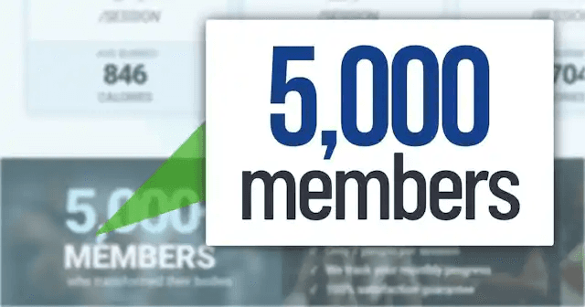
Highlight Large Numbers: Insert high numbers near your price where possible.
For example:
"Join 5,487 Satisfied Customers!"
"Invoice #8986"
"We Donated $100,000 to Charity This Year!"
The same applies to quantity:
You should think about how you display product quantities. For example, instead of saying “$49 for 3 items,” you should be flipping it around: “3 items for $49.” When customers see the second option, the “large” quantity (3) acts as an anchor, making the discount seem like a steal (Bagchi & Davis, 2012).
DECOY OPTION: POWER OF "ALMOST"
Existing products feel more appealing with a “decoy option” nearby.
Based on my findings, our brain loves choices, but having too many options can lead to decision paralysis. We can leverage this by using a “decoy option".” Imagine you’re selling a smartwatch with a comprehensive workout E-book in three tiers:
A popular study tested subscription options to the Economist magazine:
$79 — Smartwatch
$99— E-book
$99 — Smartwatch & E-book.
At first glance, this might seem like it makes no sense at all. Why Would anyone choose the “E-book” option for the same price as the bundle? The answer is they wouldn’t. It’s just the decoy option. It makes the “Smartwatch & E-book” bundle seem like a much better deal in comparison, even though the price. is identical to the “worse” option (Ariely, 2008).
CHARM PRICES: POWER OF ODD CENTS
Use “Charm” prices (e.g., $2.99, $49.95) to reduce the left digit as much as possible.
As most of you know, our brain tends to process the leftmost digit of a price first. This is why most marketers use “charm pricing.” which involves setting prices that end in numbers just below a round number. For instance, $2.99 instead of $3.00 or $49.95 instead of $50.00.
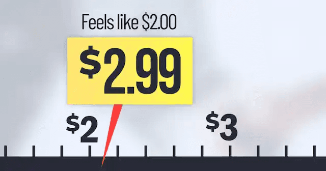
Studies show that these seemingly small differences can have a significant impact on how customers perceive the price. Even though the difference might only be a few cents, our brains tend to focus on the left digit (so the 2 or the 4 in this example) and register the price as being closer to the lower number ($2 or $49) (Troll, Frankenbach, Friese & Loschelder, 2023).
RIGHT-FACING DIGITS: A SUBTLE NUDGE
Humans are wired to look at social cues.
Numbers have a directional orientation, just like arrows. Digits like 5 and 6 are facing to the right. Based on my findings, research suggests that our brains pay more attention to subsequent digits when they follow numbers facing right (5 or 6) compared to numbers facing left (2, 3, or 4). This means customers are more likely to round down in their minds when the price ends in a 5 or 6 (Langton, Watt, & Bruce, 2000).
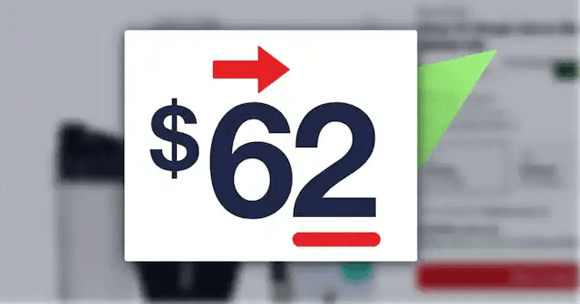
For example, a price of $15.50 might be perceived as close to $15.00 because the 5 faces right. On the other hand, a price of $13.70 might feel closer to $14.00 because of the 7 faces left.
Therefore:
Place Low Digits After 5 or 6. Customers focus on the subsequent digits. If these digits are low, they round down the price.
Place High Digits After 2, 3, 4, 7, or 9. Customers keep their attention leftward, so you can raise the remaining digits of your price more freely.
MAKE SALE PRICES LOOK DIFFERENT:
A visual difference feels like a numerical difference.
Our brains are wired to visual differences. This means that a price displayed in a different font size, color, or style will feel different in value, even if the numerical difference is small. Think about infomercials. They often show the problem in black and white and then introduce the solution in vibrant colors. This creates a sense of contrast that emphasizes the value proposition.
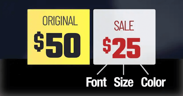
The same principle applies to pricing. Design your sale price to visually stand out from the original price. Use a different font size, color, or bolding. This will make the discount feel more significant, even if the numerical difference is relatively small (Coulter and Coulter, 2005).
PERCENTAGE VS ABSOLUTE DISCOUNTS
Below $100? Give a percent discount (20% Off). Above $100? Give an absolute discount ($20 Off.)
Why? Let’s say you’re selling a $150 smartwatch. A 20% Discount will be $30 off. So, which sounds more appealing?
20% Off
Save $30

For a product under $100, the percentage discount (20% off) might be more attractive because it emphasizes a higher numerical number of the total price. However, for a more expensive product (over $100), the absolute discount ($30 Off) might be more effective because it highlights a higher numerical number (González, Esteva, Roggeveen, & Grewal, 2016).)
Remember: These are just a few ticks you can leverage to boost your sales. However, keep in mind that none of these will do anything significant to your sales if you do not have a proven product that sells!


