Feb 10, 2024
READ TIME: 5 MINUTES
Welcome back, Renaissance man 👋 .
Today, we deep dive into a profound breakdown of a product page from one of the products we scaled over multiple 6-figures in 2021. Within this issue, we will break down all the product page sections.
TODAY, AT A GLANCE
THE FIRST IMPRESSION (SECTION 1)
SOCIAL PROOF (SECTION 2)
PROBLEM SOLVING 1 (SECTION 3)
STUDY WITH TESTIMONIALS (SECTION 4)
PROBLEM SOLVING (SECTION 5)
US VS THEM (SECTION 6)
SALES OFFER (SECTION 7)
PRODUCT OFFER (SECTION 8)
FAQ SECTION (SECTION 9)
CUSTOMER REVIEWS (SECTION 10)
HEADER AND FOOTER
OPTIMIZE ABOVE THE FOLD
THE FIRST IMPRESSION - (SECTION 1).
First and foremost, let's throw out the rulebook. Understanding our template begins with a fresh perspective on the typical eCommerce funnel.
You see, most drop shippers follow a conventional funnel approach:
They start with advertising on platforms like Facebook.
Next, they swiftly present the product offer.
And finally, customers are left to scroll down to explore product details at their leisure.
But we do things a bit differently, and here's why:
We kickstart with an attention-grabbing ad.
Then, we dive straight into an in-depth product description.
We unveil the product at the bottom of our product pages after the customer is well-informed.
This is to ensure every customer comprehensively understands the product before purchasing.
Now, let's break into why we choose this approach:
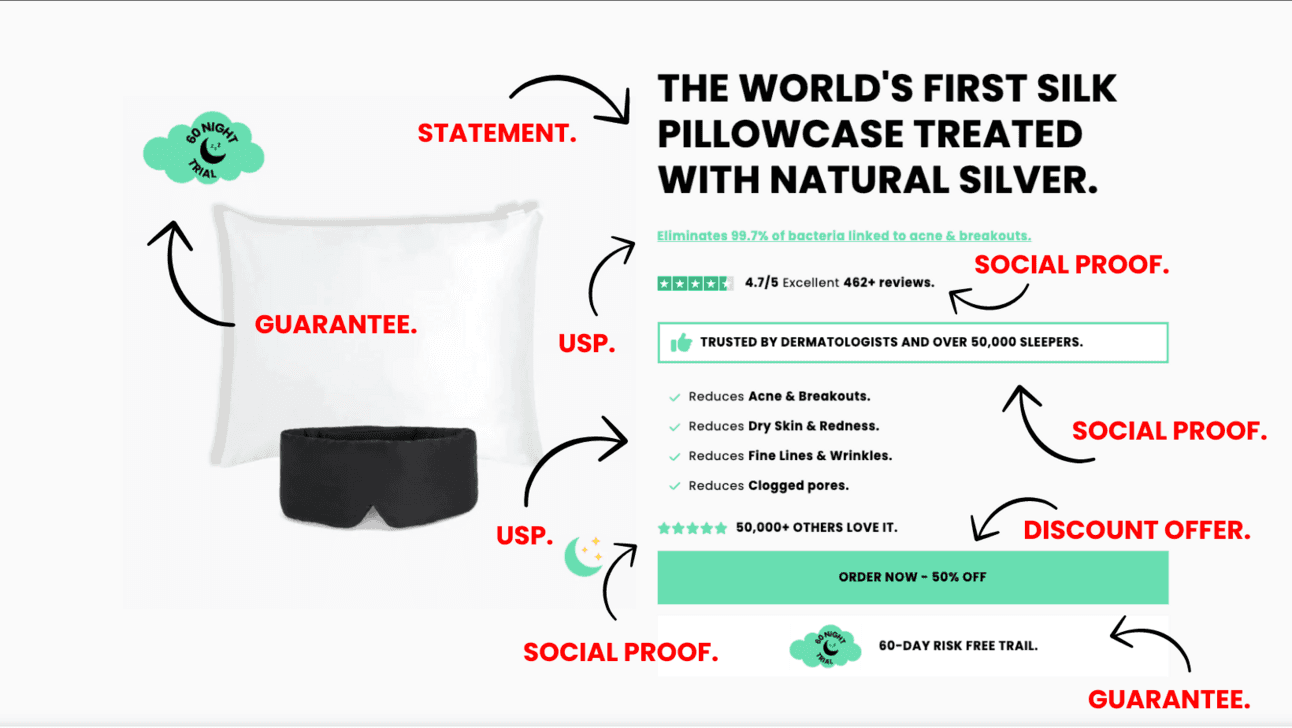
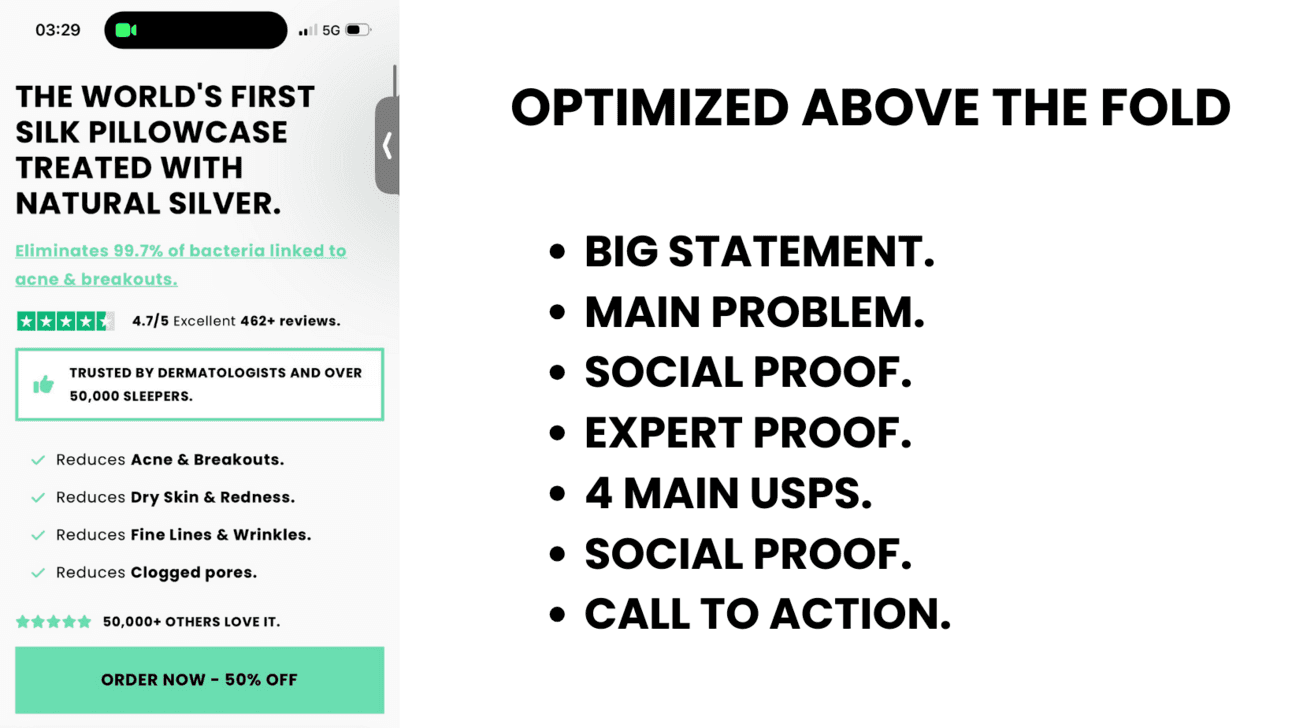
When a customer lands on our product page from Facebook or any other social platform, we aim to make a big first impression without immediately revealing the product offer.
Take a closer look at the structure of our initial landing section. It's strategically designed to captivate the customer's attention.
Featuring:
A compelling statement that takes the customer's interest.
Multiple promises to address any concerns.
Highlighted in bold green is the customer's most pressing problem.
Expert proof to build trust.
The top four standout problem-solving points.
Social evidence of 50,000+ customers from satisfied customers.
It concludes with a call to action, encouraging the customer to take a specific action.
A standard Shopify theme product page builder can't achieve this structure and engagement.
Now, here's why our approach works:
They can click on the call to action to explore the product offer at the bottom of the page.
Or, they can continue reading, diving into each section crafted to drive their purchase decision.
The customer is presented with two choices:
They can click on the call to action to explore the product offer at the bottom of the page.
Or, they can continue reading, diving into each section crafted to drive their purchase decision.
Both options hold value because:
The customer absorbs crucial product information, which influences their buying decision.
As they progress through our sections, they become better at converting for the purchase.
Instead of forcing a product offer upon the customer, we first provide them with essential conversion elements.
SOCIAL PROOF - (SECTION 2).
Your customer has made the choice we want; they've scrolled down, wanting to explore more. And that's when we spring into action to establish trust right away.
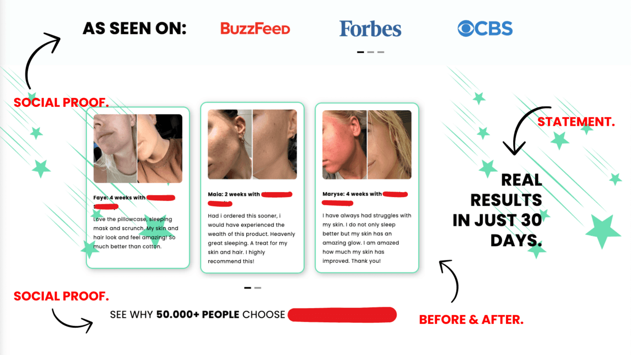
You'll notice we connected publications with our product.. This is trustworthy because these publications are highly reputable. Now, I understand your concern—the ethics of doing this approach. And I agree, it's valid.
However, this strategy can set you apart from the typical drop shipper, and here's why:
We've found that immediately aligning ourselves with these well-known names helps build trust right away.
Now, let's break down what you'll find in this section:
In the second block, we then present positive feedback from other customers. This section is reinforced by before and after photos showcasing the results our product delivers.
Do you see how powerful this is?
We're building trust with the customer and providing results achieved by other customers within just 30 days.
The third block, we cap it off with additional social proof. Remember, our primary goal is trust-building.
PROBLEM SOLVING 1 - (SECTION 3).
With the customer's trust now, it's time to spotlight our product by showcasing its problem-solving features.
Yes, problem-solving. Features are good, but it's crucial to emphasize the specific problems they solve.

Do you see how visually engaging we make every element?
Now, let's break down these blocks:
Compelling Statement: We start with an engaging statement, urging the customer to keep reading.
Short Description of USPs: Following that, we describe several Unique Selling Points (USPs) that lead to a solution for a specific problem.
Visual USPs: Below the description, we present two more USPs in a visual format complete with icons and text.
Product Image Optimization: The product image is thoughtfully edited to ensure that all other essential features are easily absorbed in seconds.
Additional Social Proof and Guarantees: Once again, we finish up the section with extra social proof and reinforced guarantees, and the customer has access again to the product offer.
STUDY WITH TESTIMONIALS - (SECTION 4).
Remember that people buy from people, not just companies when making purchase decisions. Customers who witness others enjoying a positive experience are more likely to follow the pack.
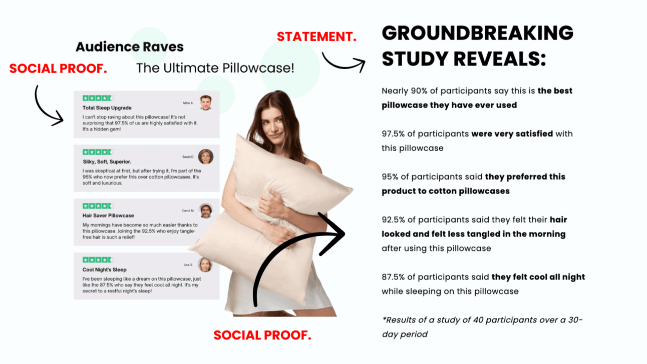
Once again, see how we've transformed this section into visuals again.
Now, let's break down these blocks:
4 Testimonials with Faces: We begin with compelling testimonials, complete with the faces of satisfied customers. This not only builds trust with your product but also adds credibility.
Engaging Statement: An attention-grabbing statement that encourages customers to keep reading.
Case study: Besides testimonials, we continually introduce a study correlated to the testimonials. This strategy is valuable, especially when combined with other social proof elements.
But what makes this so effective?
It addresses and correlates with your target audience's everyday problems when purchasing your product.
Within the study, we've touched upon the top 5 issues this audience encounters when considering this product.
PROBLEM SOLVING 2 - (SECTION 5).
You must thoroughly research your audience and gain an understanding of their needs and desires as no other.
Always ensure that you provide value to your customers. By focusing on their needs and offering solutions, you enhance their satisfaction and boost your chances of conversion.
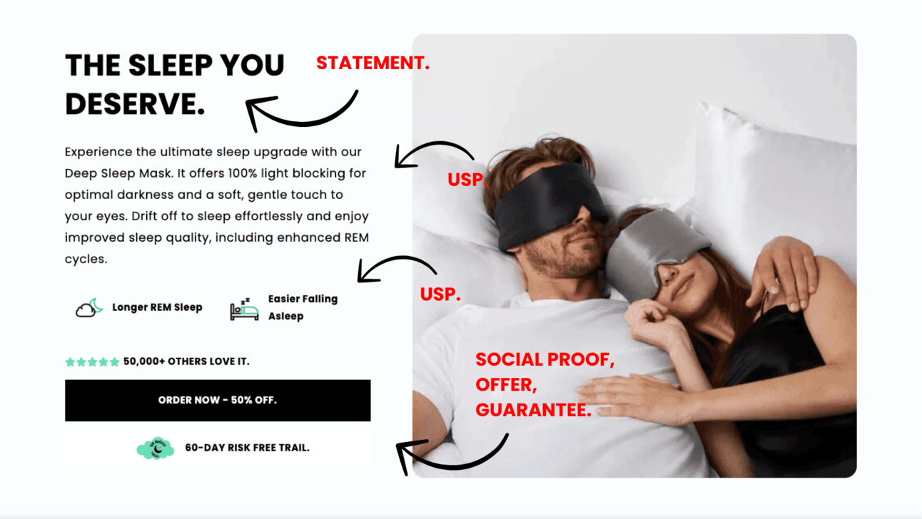
Once again, we've implemented unique problem-solving aspects not highlighted in previous sections.
Now, let's break down these blocks:
Engaging Statement: An engaging statement at the beginning maintains the customer's interest, encouraging them to delve further into the content.
Product Features and Problem Solving: A concise product description follows, showcasing the features and highlighting how they solve various problems.
Visual Problem-Solving Icons: We've visualized the problem-solving aspects with two icons to simplify information absorption.
Lifestyle Image: A high-quality lifestyle image within this section. Not only does it help customers visualize themselves using the product, but it also makes sure the product's versatility appeals to both genders.
Social Proof and Guarantees: As with other sections, we conclude with additional social proof, reiterating trustworthiness and providing an opportunity for customers to access the product offer.
US VS THEM - (SECTION 6).
As we already Have:
Built Trust: Built trust through various sections, emphasizing social proof.
Highlighted Unique Features: Multiple unique features have been brought to the front.
Addressed Unique Problem-Solving Aspects: The product's problem-solving aspects have been discussed in detail.
Now, it's time to make it clear to the customer that they need not look any further because your product is the best in the market.
By incorporating a "US VS THEM" section, you can show them your product is better than anyone else.
SALES OFFER - (SECTION 7).
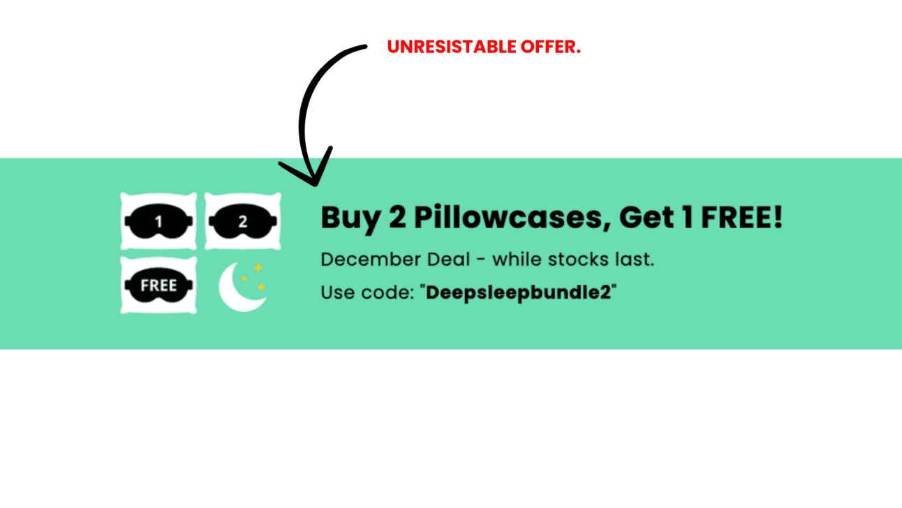
Do you see the funnel taking shape?
Gradually try to get the customer's interest with various aspects and reassurances, and then present an irresistible promotion to win them over.
The customer has navigated through the funnel.
They've absorbed multiple sections of social proof with the positive experiences of others.
They've seen the product associated with several big publications, building credibility.
The unique features of the product have been highlighted, demonstrating its value.
The problems it solves have been presented, resonating with the customer.
They've understood why your product differs from the competition in every aspect.
And now, we're closing with a 2+1 free offer.
If the customer has been reading attentively, they're more likely to convert than if we had thrust the product offer at them immediately.
PRODUCT OFFER - (SECTION 8).
Now, the most critical section.
The customer has been meticulously informed, and we've presented an irresistible offer.
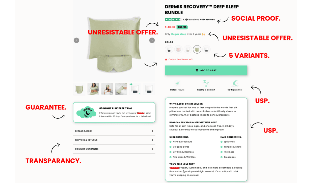
Take a moment to see how structured this product section is. A structure can never be achieved with any Shopify theme product builder.
Within this section, our goal is to summarize all the information the customer has absorbed in the previous areas.
Let's break down the elements:
Product Title: It's designed to resonate with the customer's desire for a deep sleep.
Immediate Social Proof: Building trust continues with social proof right at the start.
Irresistible Discount: We showcase a 50% discount, emphasizing that it costs just 10 cents per night over two years
Limited Variants: We offer just five variants, not more, to simplify the customer's choice and streamline the checkout process.
USPs Reminder: Three key USPs are placed under the "Add to Cart" button to reinforce their value.
Summary Block: Here, we summarize everything we've discussed thus far.
Guarantee Section: We highlight a 60-day free night trial on the left, offering peace of mind.
Transparency Insights: A section diving deeper into materials, shipping, returns, and the 60-day guarantee.
FAQ SECTION - (SECTION 9).
Even though we've provided much information throughout the product page, it's impossible to address every question. That's why including a FAQ section beneath the product offer is required.

This structure follows the familiar format where customers often find the FAQ section below the product offer. This approach keeps navigation straightforward and user-friendly.
In this section, we've diligently addressed the potential questions that customers may still have, which could be a deciding factor in their purchase.
Our process thoroughly examines various product listings on platforms like Amazon. We carefully review customer feedback and testimonials.
Doing so ensures that our FAQ section is comprehensive and effective in addressing any customer concerns.
CUSTOMER REVIEWS - (SECTION 10).
In this final section, we aim to alleviate any doubts and give potential customers more social proof.

Like the FAQ section, this structure follows a standard format that customers know well—placing the FAQ section and customer reviews below the product offer.
By positioning these two sections beneath the product offer, we ensure that potential customers have easy access to critical information to help them decide.
HEADER AND FOOTER.
We always disable the header and footer for all the product pages we optimize with PageFly. This design choice has a purpose, which is to provide a streamlined and distraction-free checkout process.
We eliminate any other visible links within the product page by removing the header and footer. Customers cannot browse through your website or get sidetracked by unrelated content.
This approach serves a crucial function:
Simplicity: There are no distractions on the product page other than the strategically placed calls to action and the Add to Cart button—this focuses on guiding the customer toward a purchase in their decision-making process.
Clear Path to Checkout: The customer only has two choices: adding the product to their cart and moving to checkout or leaving the website.
Mandatory Links: You'll notice that at the bottom of the page, there are two links: "TERMS OF SERVICE" and "PRIVACY POLICY." These links are required elements for all product pages. By minimizing distractions that might distract the customer from the product page, we enhance the chances of conversion.
OPTIMIZE ABOVE THE FOLD.
We always disable the header and footer for all the product pages we optimize with PageFly. This design choice has a purpose, which is to provide a streamlined and distraction-free checkout process.
We eliminate any other visible links within the product page by removing the header and footer. Customers cannot browse through your website or get sidetracked by unrelated content.
This approach serves a crucial function:
Simplicity: There are no distractions on the product page other than the strategically placed calls to action and the Add to Cart button—this focuses on guiding the customer toward a purchase in their decision-making process.
Clear Path to Checkout: The customer only has two choices: adding the product to their cart and moving to checkout or leaving the website.
Mandatory Links: You'll notice that at the bottom of the page, there are two links: "TERMS OF SERVICE" and "PRIVACY POLICY." These links are required elements for all product pages. By minimizing distractions that might distract the customer from the product page, we enhance the chances of conversion.


